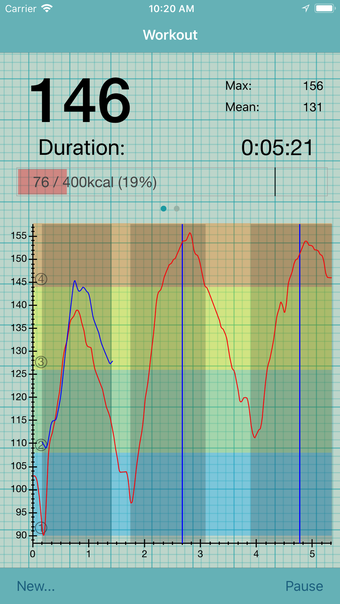
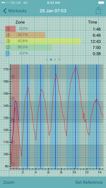
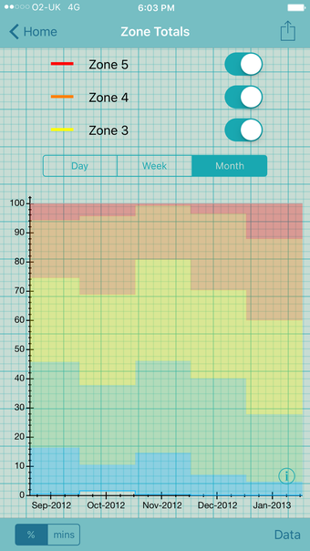
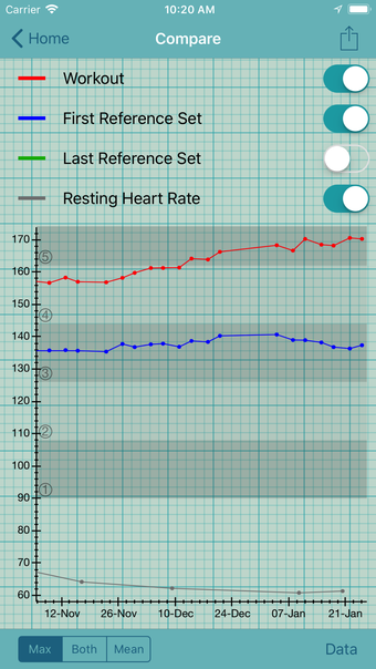
The Heart Graph on the iPhone
The graph is generated by measuring the heart rate, which is recorded in real-time and importing existing data from the iPhone’s built-in HealthKit.
There are several options in the settings. For example:
- Select ‘Multiple Graphs’ from the dropdown menu to see more than one graph simultaneously.
- To reduce the visual clutter, you can set the ‘Maximum Y value’ value to something greater than 1.
- To get a different time interval between the two graphs, simply change the value of ‘X Interval.’
The heart graph is generated using a smooth spline and then converted into a graph. It does not represent any scientific or medical model of a heart.